Why shouldn’t we justify text online?
Key takeaways – justifying text online
- Justifying text online is a bad practice that creates problems for readers.
- The best practice is to align text to the left side, even if it sometimes creates a ragged right edge of the text.
- It is good to follow best practices and use rules recommended by WCAG standards, allowing users with different disabilities to enjoy easy text reading or listening.
Table of Contents
Table of Contents
- Key takeaways – justifying text online
- How do people read text online?
- What are types of text alignment?
- Why don't we justify texts online?
- Justified text creates "rivers of white".
- Examples of different types of text-align online.
- Web technology is not ready for justification, or perhaps it is not the case.
- Why newspapers and books have justified text?
- Examples of different approaches with text alignment in books.
- Examples of different approaches with text alignment in newspapers.
- Screen magnifier users.
- Justifying text impact on SEO.
- Text justify and WCAG standards.
- Summary
- Frequently Asked Questions about justify text online.
How do people read text online?
In western culture, LTR (left-to-right) writing is a standard and left alignment of text is a natural way for text reading. The essential insight for this topic is eye-tracking visualizations research and study “F-Shaped Pattern For Reading Web Content (original study)” by Nielson Norman Group (16 April 2006).
From the study:
[…] Summary: Eyetracking visualizations show that users often read Web pages in an F-shaped pattern: two horizontal stripes followed by a vertical stripe.
F for fast. That’s how users read your precious content. In a few seconds, their eyes move at amazing speeds across your website’s words in a pattern that’s very different from what you learned in school. […].
The image shows a left-to-right F-shaped reading pattern with the main focus on rows/lines scanning. Picture source: https://www.nngroup.com/articles/f-shaped-pattern-reading-web-content-discovered/
The paragraph and pictures above describe the best practices for online text editing and presentation on the website. With the increasing flow of easy-to-use (but mostly useless) website builders, we observe a growing amount of lousy typography, including this fundamental formatting error – fully justified texts.
What are types of text alignment?
Text alignment is a paragraph formatting attribute that determines the appearance of the text in a whole paragraph and allows users to align text on a page/paragraph horizontally. There are four possibilities:
- left (left aligned text)
- right (right aligned text)
- centred (aligned to the centre)
- justified (aligned to left and right)
What is hyphenation?
Hyphenation is the automated process of breaking words between lines to create more consistency across a text block. In justified text, hyphenation is mandatory. In the left-aligned text, hyphenation evens the irregular right edge of the text, called the rag.
What is kerning?
Kerning is the space between two individual characters and the process of adjusting the spacing between characters in a proportional font to achieve a visually pleasing result. In the kerning, the space between individual letterforms is adjusted. The two-dimensional blank spaces between each pair of characters have a visually similar area in a well-kerned font.
Why don’t we justify texts online?
The main reason is that it is a bad practice and makes reading more difficult. Many people with cognitive disabilities have a great deal of trouble with blocks of text that are justified (aligned to both the left and the right margins).
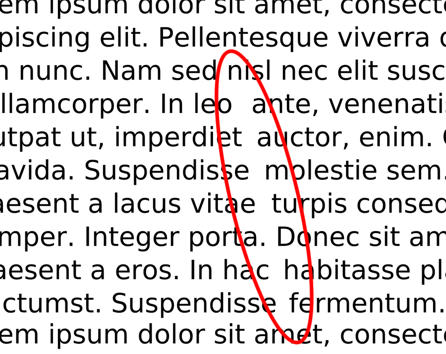
Justified text creates “rivers of white”.
The spaces between words create spaces running down the page, making the text difficult for some people to read. This problem is known as the “rivers of white.” The best way to avoid this problem is not to create a fully justified text layout (aligned to both the left and the right margins). It can be a problem for people with impaired sight or dyslexia, making reading difficult, if not impossible. Reading justified text can be a problem for people without any disability, either.
The “rivers of white” effect are usually more substantial on narrow, mobile devices.
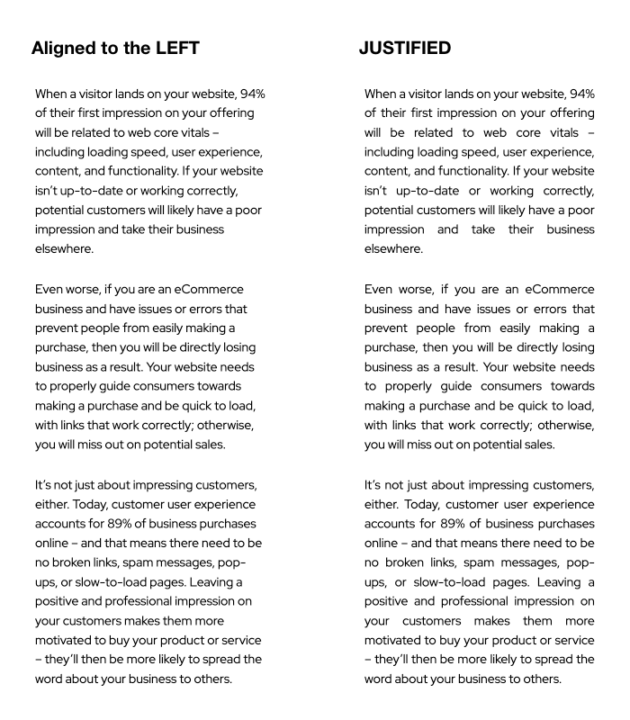
Examples of different types of text-align online.
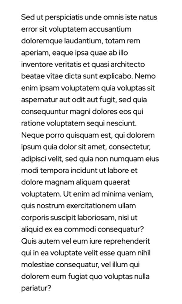
Text aligned to the left margin.
This type of justified alignment is a standard for online use. To achieve it using CSS, use the CSS “text-align: left;” in the element, for example, paragraph.
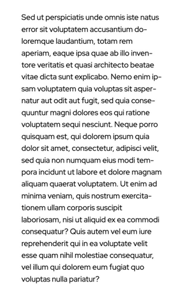
Text alignment left with CSS auto hyphenation.
This type of justified alignment is sometimes used on web pages. To achieve it using CSS, use the CSS “text-align: left; hyphens: auto;” in the element, for example, a paragraph.
Hyphenation in CSS is a method of controlling when words at the end of lines should be hyphenated using the “hyphens” property. It has been adopted in most browsers, but still, some can render it improperly.
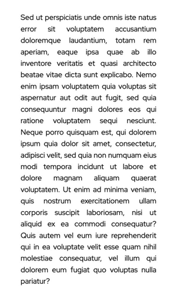
Text aligned to the left and right sides with auto kerning.
This type of justified alignment is easy to achieve using CSS. Use the CSS “text-align: justify;” in the element, for example, paragraph. We don’t advise this justify option. In HTML/CSS, kerning is automated, and you can’t predict the effect. It depends on the element size and changes with the browser window size change. Kerning will look different on different screen/element sizes.
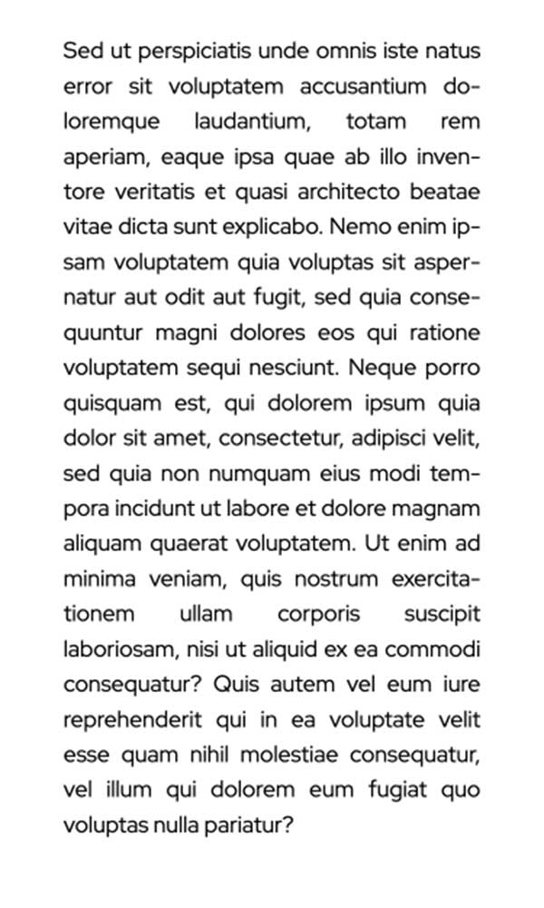
Text aligned to the left and right sides with auto kerning and hyphenation.
This type of justified alignment is easy to achieve using CSS. Use the CSS “text-align: justify; hyphens: auto;” or different values for “hyphens” property. As I wrote, we don’t advise this justify option even with hyphenation.
Justified text can be much harder to read on mobile, and the narrow screen can make the text look even more cluttered and difficult to follow. Significant gaps between words interrupt the reading flow.
An additional problem is with the text lines/rows tracks. While the reader’s eye is scanning each line, it’s easier for her to find the following line if the lines are of uneven length (jagged). It is especially true for dyslexic readers.
Web technology is not ready for justification, or perhaps it is not the case.
Automatic hyphenation on the web has been possible since 2011 and is now broadly supported. There is far more control available to designers than just turning on hyphens.
But, browsers that render CSS and HTML lack most of these features. All they do is increase the spacing between words, which leads to nasty gaps within the text block – especially if the text block has the ideal line length of 8–15 words. CSS does have a hyphens property, but even if most browsers supported it, hyphenation alone wouldn’t be enough to make justified text okay.
Continuously evolving development of HTML and CSS will allow us to use hyphenation and kerning in online text editing. Check the current state of the support of hyphenation and kerning in the browsers on the Can I use (caniuse.com) website.
Why newspapers and books have justified text?
Professional print services use hyphenation or kerning to resolve the “rivers of white” problem. Opposite to online book or newspaper/magazine size can’t change it’s printed. It is the main difference and is used to do manual kerning and hyphenation, which is a long typesetting process. Usually, the effects are excellent.
Modern books and magazines are inherited left-side alignment from the online. We can guess that it resulted from an arduous and laborious manual typesetting process. Another reason is to use the same tools for the typesetting and design of the text. User experience online also matters. Nobody wants to see differently-looking pages after switching between two worlds – online and printed.
Examples of different approaches with text alignment in books.
Traditional book The Real Mad Man by Andrew Cracknel (Quercus, 2011).
Modern book “Different Brains Different Approaches by Huub van Osch (Bis Publishers, 2016).
Examples of different approaches with text alignment in newspapers.
Justified text options, kerning and hyphenation.
Text aligned to the left side.
Both examples of aligned text are from the same newspaper, “Good Weekend” – Sydney Morning Herald weekend insert.
Screen magnifier users.
Uneven word spacing can also cause problems for people with various vision impairments who use screen magnification software. Many magnifiers work by enlarging the area around your mouse cursor. Large uneven spaces are also magnified, making it difficult to follow the words with their magnifying software. Instead of following the flow of words along even spacing, users have to find the start of each new word. For these people, the already exaggerated spaces between words are magnified still further, making the gaps even harder to jump across.
Justifying text impact on SEO.
Justified text can also indirectly impact SEO (Search Engine Optimisation). If your site’s pages are hard to read, people are less likely to stick around and read them. It can lead to lower engagement rates, which can, in turn, hurt your site’s ranking in search results.
Additionally, justified text can be harder to read on mobile devices. Finally, this text layout can indirectly impact your site’s search engine optimization (SEO). Overall, it’s best not to justify texts online to make your site more accessible and user-friendly. As we mentioned before, the best overall is to align text to the right on a whole website.
Text justify and WCAG standards.
What is WCAG?
Web Content Accessibility Guidelines, or WCAG, is considered the benchmark for website accessibility. WCAG is an acronym for Web Content Accessibility Guidelines. Created by the World Wide Web Consortium (W3C), following WCAG guidelines is the best and easiest way to make your website usable for all your customers.
WCAG statements about justifying text on the web page.
1.4.8 Visual Presentation: For the visual presentation of blocks of text, a mechanism is available to achieve the following: (Level AAA)
- Foreground and background colours can be selected by the user.
- Width is no more than 80 characters or glyphs (40 if CJK).
- Text is not justified (aligned to the left and the right margins).
- Line spacing (leading) is at least space-and-a-half within paragraphs, and paragraph spacing is at least 1.5 times larger than the line spacing.
- Text can be resized without assistive technology up to 200 percent in a way that does not require the user to scroll horizontally to read a line of text on a full-screen window.
Point 3 clearly describes how to follow the WCAG success criterion in the WCAG audit. Don’t justify texts online. It is worth mentioning that in many countries (e.g. EU), websites and apps of public sector bodies need to meet specific technical accessibility standards. The Web Accessibility Directive (Directive (EU) 2016/2102) has been in force since 22 December 2016. It provides people with disabilities with better access to websites and mobile apps for public services. This directive is a consequence of applying Article 9 of the United Nations Convention on the Rights of Persons with Disabilities (UNCRPD).
In Australia, the government enacted the accessibility regulations for public sector bodies on 23 September 2018. Australian government states […] on the website that under the Disability Discrimination Act 1992, Australian Government agencies are required to ensure information and services are provided in a non-discriminatory accessible manner. […] and […]australia.gov.au is currently compliant with Level A of the Web content accessibility guidelines version 2.0 (WCAG 2.0) standard. It is being upgraded to Double A compliance over time. In some cases, the content will be accessible to Level Triple A.[…]”
Modern and progressive web design should follow the best practices in designing and developing web pages. From our experience, after testing hundreds of pages, it is visible that many websites don’t follow the rules mentioned.
Summary
Justifying texts on your site is a bad practice because of the many different screen sizes and resolutions. Text alignment will never look perfect. While editing text for the print, the designer has complete control of its outcome, and the text print will look as designed.
Keeping in mind many combinations of website browsers and apps, a website designer can not be sure how the browser will render the justified text on the screen.
An internet website is not ideal for justified text content because too many factors can change. The good practice is to avoid this practice for online texts.
We’re ready to help
If you need assistance with your WordPress website or online marketing, contact one of our specialists via the contact form.
Frequently Asked Questions about justify text online.
In several places in this article, we wrote that full justification of the text is not a good practice on the web page, especially on smaller screens. Reassuming, justified text online creates “rivers of white” on smaller screens, and it’s hard to read for people with impaired sight or dyslexia, making reading difficult, if not impossible. Reading justified text can be a problem for people without any disability, either.
Following the WCAG and other standards, justifying text online is a bad practice. For a good user experience, align the text left, and use different text-align types only for particular purposes.
We do not advise justify text, but you can use CSS property “text-align: justify;” or HTML property align= “justify”. HTML property, in some cases, can be depreciated.
You can use four types of alignment in CSS and two additional parameters. The text-align property specifies the horizontal alignment of text in an element.
Syntax: text-align: left|right|center|justify|initial|inherit;
Inherit sets align inherited from the parent element (parent element in CSS). It formats text alignment to the left align, right align, centred, and justified. Initial sets the property to the initial value (the initial for text-align is left). Read more about it on the W3C website.
The most readable is the text aligned to the left. It works best for all readers in the Western culture with LTR (left-to-right) reading direction.
The simple answer is yes, and we proved it in the paragraphs above. Only printed newspapers still justify text, but not all of them. Printed newspapers use professional editors who can modify the line and spacing between words and other text elements to make it easier to read
Yes, the justified text is generally harder to read because eyes don’t have any reference point on the right edge, and it’s hard to eye-navigate between lines. Also, changing and irregular spacing between words makes reading harder. Reading justified text can even be impossible. For many people with disabilities, it will be distracting.
Alignment is a broader term than justification. Align, or alignment, includes four different types of text formatting. Justification is one of these types with alignment to left and right, which creates all the lines equal in length.